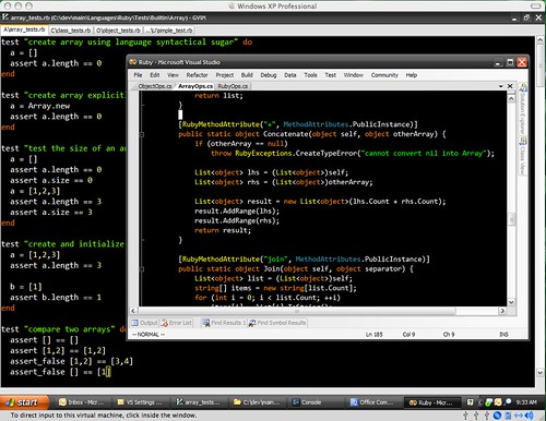
John Lam ported Textmate's Vibrant Ink theme to Visual Studio. Get it here.
Awesome. Note that toolbar buttons are nowhere to be seen. I noticed that while I'm only barely use toolbar, it still takes lots of space and more irritating - distracts attention like xmas tree and tends to rearrange itself I have no idea why. Besides turning toolbar off is the best way to learn keyboard shortcuts and once you do so you never look back. While you at it, here is a nice Visual Studio .NET 2005 Keyboard Shortcuts poster from Jeff Atwood.
I'm a big fan of such kind of color themes. So far I was using Scott Hanselman's Visual Studio 2005 Font and Color Settings, but now I feel that's not eXtreme enough for me.
Btw, Windows Zune Theme is perfect match for Vibrant Ink theme. Try them out.
Update: check out also cool Moria color scheme port for Visual Studio by Tomas Restrepo (see comments).


Thanks! I love it! (For Visual Studio 2005/2008)
cadmium, what about assigning a keyboard shortcut for Build.ConfigurationManager command?
Still it would be nice to have some cue about what current configuration is...
That would be nice plugin if it could insert current configuration name into status bar below for example.
One question. How do you tell which active configuration you are in (debug, release, etc) and how do you switch between them.
That's about the only thing I use the toolbar for, but I use it all of the time.
Yep, black background. And I like it!
Holy crap that's an ugly ass editor scheme. And the background? Black? I prefer a cornflower blue, myself. That's just nasty.
I have a few dark themes on my site as well, if you haven't seen them before:
http://www.winterdom.com/weblog/2007/04/30/VisualStudioMoriaAlternate.aspx
http://www.winterdom.com/weblog/2006/09/20/ATweakedColorSchemeForVS2005.aspx